OVERVIEW
Project Background
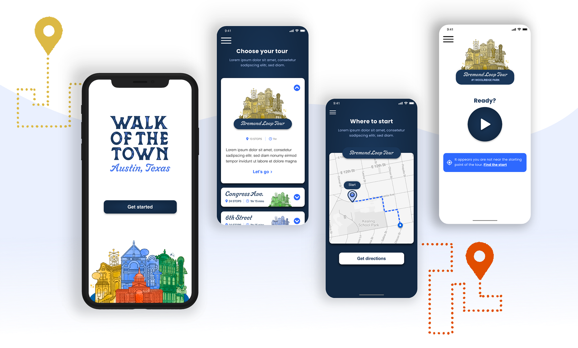
A mobile app designed to tour the rich history of downtown Austin, Texas. Explore the city with different listening options and four featured tour routes. Each tour includes flashback images and small featured stories that pop up throughout the tour.
The Team
Client Leadership Austin, City of Austin, Texas
Design Team Myself, Mariana Wild, JJ Livesley, Hanna Holt
Project Management Kristi Helm, Madison Mashewske
Development Holden Christiansen, Mason Posch
The Original Problem
Leadership Austin wanted to find a solution to support the city's past. They asked us to create a mobile app that empowers users to tour downtown Austin in their own way. In the early stages of the project, we identified these key obstacles that we needed to tackle in order to achieve the goal:
- How will the user navigate the tour?
- Which historical sites and how many will need to be featured?
- Accommodate different types of users. Do they want an audio-only experience or to dive into the details with an accompanying visual experience?

My role + challenges
I was onboarded in the middle stages of the project. The project was put on hold for some time but, it was picking back up with many new challenges. My introduction was to address any quirks in the usability of the current interface designs. Another designer and I collaborated to solve some of the following obstacles:
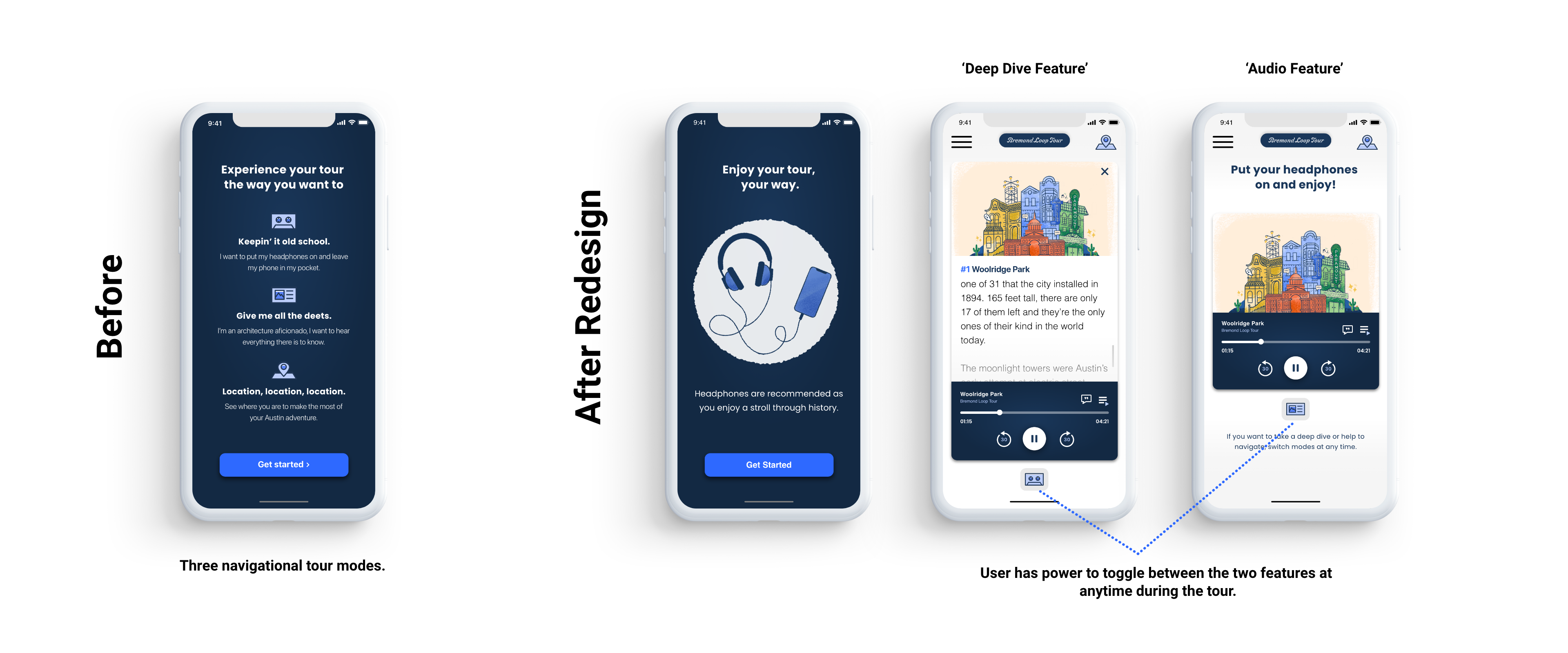
1. Iterated and evolved the design language of the app from the early stage 'pitch' designs
2. Troubleshoot and reduce the 'How-to-tour' modes.
3. During the tour, how can the user find their location?
4. Address directional cues: how will the user know to begin the next tour? (Will their location trigger the app to automatically start the tour when they arrive at the next stop or will they manually 'push-to-start'?)
After these questions were addressed, I began implementing them into the design and brought it to the final product phase.
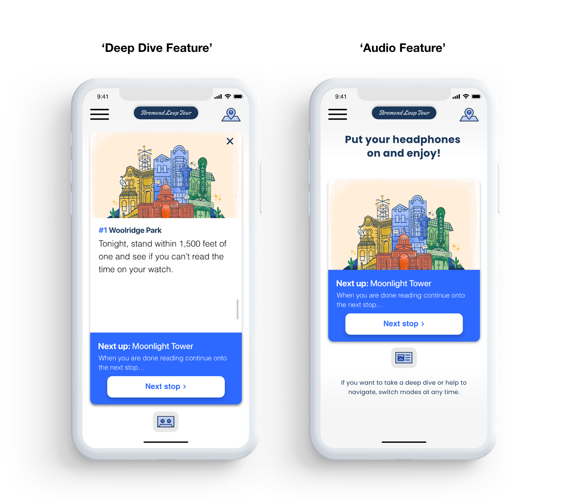
Design Challenge 1: Reduce and solve the current tour modes
Previously the design consisted of three modes you can experience the tours in: 'Audio only tour,' 'Deep dive tour,' or 'Map navigation tour.'
To solve this, we found that the "modes" would be more beneficial to the user as "features" integrated into one core experience. We did not remove the ability for the user to choose their tour mode but, granted them full access to all 'modes' as 'features' during their experience.
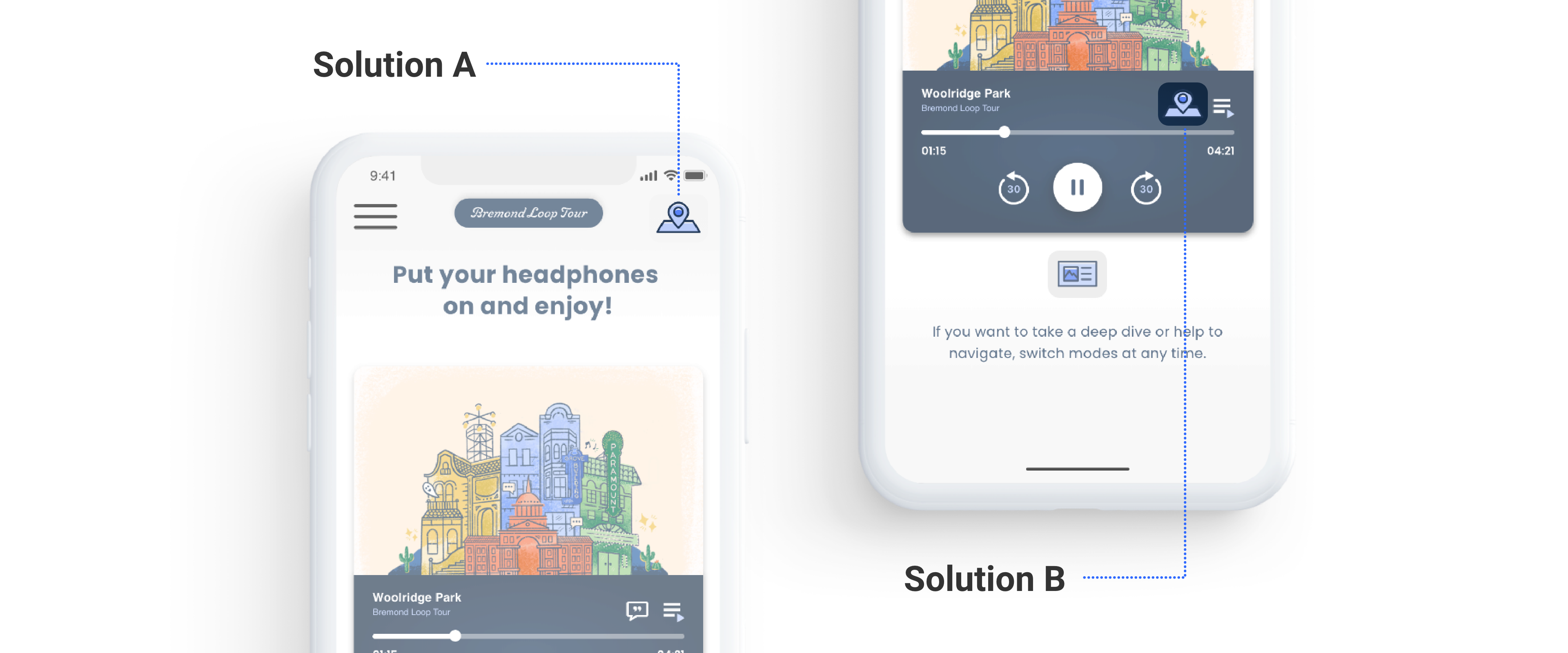
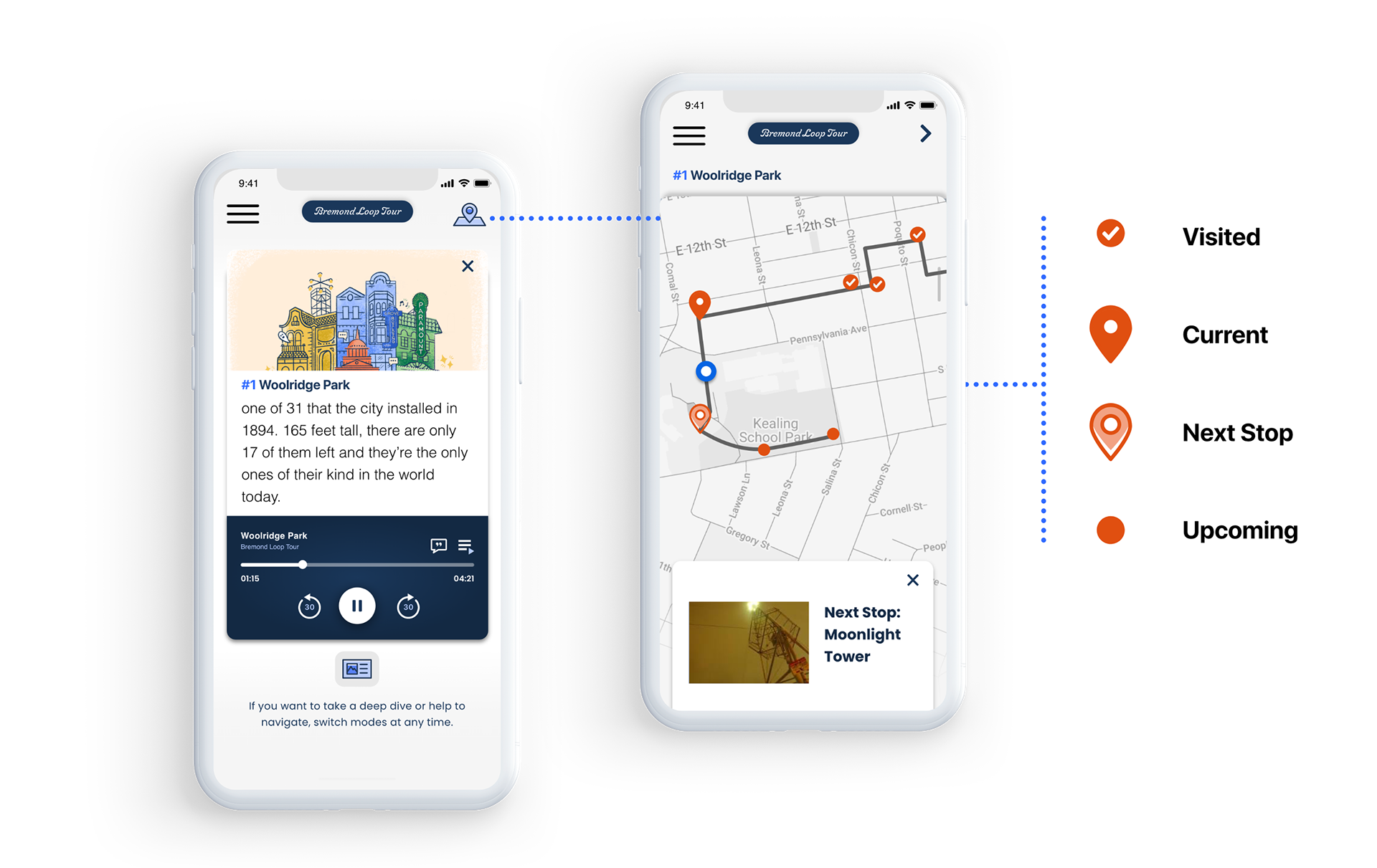
Design Challenge 2: Ideate and redesign a ‘map view’ interface that grants the user full access to their location while en route
First things, first, since we removed the ‘Map navigation tour’ mode from the previous challenge, we needed to find a new spot in the app for a similar locating feature. In order to resolve this, we used the ‘map view icon’ to grant users access to their location, here were the results:
Solution A: Place the icon in the right top corner of the active tour interface.
Solution B: Place the icon in the audio controls interface.
The ‘map view icon’ was accessible in both spaces throughout the tour but, one solution visually outweighed the other. Solution A was the winner. The problem we found with Solution B, was that the audio UI became visually overwhelming, it had too many audio controls which made it harder for the user to find the ‘locating’ feature.
The second part of the challenge entailed troubleshooting the functionality of the ‘map view’ interface to serve as a locating feature for the user. We decided to redesign the map interface to not only locate the user en route but, to guide the user through the tour. Within each of the tour options, there are historical ‘stops’, that are marked in the map view interface. The ‘stops’ are labeled with a navigational icon that updates as the user moves from one stop to the next. Each time the user moves from one stop to the next, the navigational icon will change color based on the status of where the user is on their tour.
As a result, the user can now access their location at any time and easily track their progress along the way.
Design Challenge 3: Grant power to the user power to progress through the tour at their own convenience
The team tested the prototype in real-time and found it challenging to know when to proceed and begin "playing" the next stop if the user had the app open and was engaging with the 'Deep Dive' content. We decided to deactivate the automated GPS functionality when the app was open and being used. In doing so this would grant power to the user to proceed when they are ready.
We designed a button, that allows users to move onto the "next stop". The button is triggered when the tour ‘stop’ has come to an end and allows users to move at their own pace.